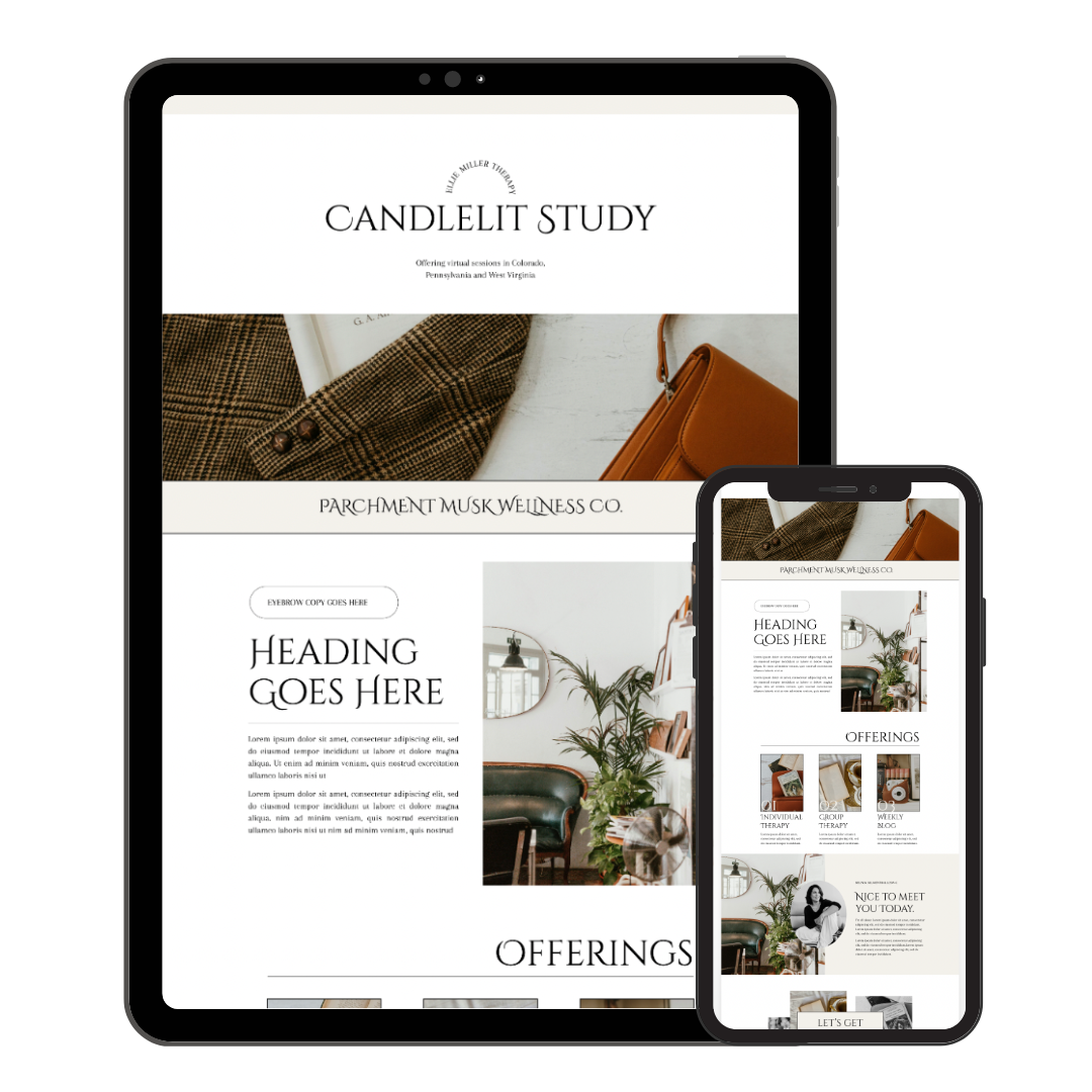
15 Stunning Squarespace Font Combinations for Your Therapist Website

Choosing the right font combination can make a significant difference in how your website is perceived. The right mix of header, paragraph, and accent fonts can create a visually appealing and professional look.
Here are fifteen stunning Squarespace font combinations to inspire your website design:
Why Font Choice Matters for Therapist Websites
Choosing the right fonts is more than just an aesthetic decision; it’s about creating an environment that feels safe, professional, and inviting.
For therapist websites, the right font combination can enhance readability, convey trust, and make your content more engaging. In this post, I’ll show you how to use Squarespace font combos to create a cohesive and appealing design that supports your practice’s goals.
Fonts are a subtle yet powerful tool in web design, especially for therapist websites. They can influence how visitors perceive your practice and whether they feel comfy reaching out to you.
The right font choices can make your website feel more professional, approachable, and easy to navigate. In this guide, I’ll share fifteen stunning Squarespace font combinations that will help you create a website that truly reflects your therapeutic approach.

10 Benefits of Thoughtful Font Choices for Therapist Websites
Choosing the right font combinations for your therapist website is crucial. Here are ten benefits of putting thought into your font choices:
Enhanced Readability: Clear, easy-to-read fonts ensure that your content is accessible to all visitors, making it easier for them to engage with your site.
Professional Appearance: Well-chosen fonts can convey professionalism, helping to establish trust with potential clients from their first visit.
Consistent Branding: Using consistent fonts across your website helps reinforce your brand identity and makes your site look cohesive.
Improved User Experience: Thoughtful font choices can guide the user’s eye through your content, enhancing navigation and overall experience.
Emotional Impact: Fonts can evoke certain emotions and set the tone for your website, making visitors feel welcomed and comfortable.
Better Engagement: Attractive fonts can make your content more appealing, encouraging visitors to stay longer and explore more of your site.
SEO Benefits: Clean, well-organized text can improve your site’s SEO, making it easier for search engines to index your content.
Accessibility: Choosing accessible fonts ensures that all visitors, including those with visual impairments, can read your content easily.
Differentiation: Unique font combinations can help your website stand out from competitors, making a memorable impression on visitors.
Increased Conversions: Clear and compelling font choices can improve call-to-action buttons’ visibility, leading to higher conversion rates.

1. Modern Elegance
Header: Helvetica Neue
Paragraph: Georgia
Accent: Playfair Display
Why it works: Helvetica Neue gives your headers a clean, modern vibe that’s perfect for making a strong first impression. Georgia adds that classic touch to your paragraphs, making the text super readable and approachable.
Playfair Display as an accent font brings in a dash of elegance and sophistication, great for highlighting quotes or important points.
Best used for: Professional therapist and coaching websites that want to look trustworthy and sophisticated, while still feeling approachable.
Color Palette Suggestion: Pair these fonts with neutral colors like black, white, and gray, and add accents of gold or navy blue to keep things elegant and modern.

2. Clean and Minimal
Header: Montserrat
Paragraph: Open Sans
Accent: Lora
Why it works: Montserrat is sleek and minimalist for headers, making your site look fresh and modern without too much fuss.
Open Sans is great for body text – it’s clean and easy to read. Lora adds a touch of elegance for accents, perfect for quotes and highlights.
Best used for: Modern, minimalist therapist and coaching websites that want to keep things simple and straightforward.
Color Palette Suggestion: Stick with a monochromatic scheme and add pops of color like teal or coral for a bit of personality.


3. Chic and Stylish
Header: Futura
Paragraph: Helvetica
Accent: Abril Fatface
Why it works: Futura’s geometric shapes give your headers a modern and trendy feel, while Helvetica keeps your paragraphs clean and simple.
Abril Fatface brings in a chic, stylish flair that's perfect for accents, making key points stand out beautifully.
Best used for: Therapist and coaching websites that want to look trendy and stylish while staying professional and approachable.
Color Palette Suggestion: Pair these fonts with a mix of neutral tones like black, white, and gray, and add some chic accents like blush pink or gold to keep things stylish and fresh.

4. Classic and Timeless
Header: Libre Baskerville
Paragraph: Arial
Accent: Raleway
Why it works: Libre Baskerville brings a classic and sophisticated feel to your headers, making a strong yet elegant statement.
Arial is a versatile and highly readable font for paragraphs, ensuring your content is accessible and easy to read.
Raleway adds a modern twist as an accent font, providing just the right touch of style without overpowering the classic look.
Best used for: Therapist and coaching websites that aim to convey professionalism, reliability, and a timeless appeal. Perfect for practices that want to instill trust and confidence in their clients.
Color Palette Suggestion: Stick with timeless colors like navy, ivory, and charcoal, and add subtle accents of burgundy or forest green to enhance the classic feel.

5. Bold and Dynamic
Header: Oswald
Paragraph: Lato
Accent: Merriweather
Why it works: Oswald’s bold and condensed style makes your headers stand out, creating a strong and dynamic impression.
Lato offers a clean and modern look for your paragraphs, ensuring readability without sacrificing style.
Merriweather adds a touch of elegance and depth as an accent font, perfect for highlighting important information.
Best used for: Therapist and coaching websites that want to convey energy, confidence, and a modern edge. Ideal for practices that aim to make a strong impact while remaining approachable and professional.
Color Palette Suggestion: Go for high contrast colors like black and white, with bold accents such as red, electric blue, or vibrant green to enhance the dynamic feel.


6. Elegant and Sophisticated
Header: Playfair Display
Paragraph: Source Sans Pro
Accent: Great Vibes
Why it works: Playfair Display gives your headers an elegant and refined look, perfect for making a sophisticated statement.
Source Sans Pro offers a clean and professional appearance for paragraphs, ensuring your content is readable and approachable.
Great Vibes adds a touch of sophistication and charm as an accent font, ideal for highlighting important information with a flourish.
Best used for: Therapist and coaching websites that want to convey elegance, sophistication, and a high level of professionalism. Perfect for practices that aim to create a welcoming yet refined atmosphere.
Color Palette Suggestion: Pair these fonts with soft, neutral colors like ivory, taupe, and charcoal, and add accents of gold or deep teal to enhance the sophisticated feel.

7. Professional and Polished
Header: Roboto
Paragraph: Georgia
Accent: PoppinsMake it stand out
Why it works: Roboto's clean and modern style makes your headers look sharp and professional, setting a polished tone right from the start.
Georgia, with its classic serif design, ensures your paragraphs are highly readable and convey a sense of trust and reliability.
Poppins adds a contemporary and stylish touch as an accent font, perfect for highlighting key information and making it stand out.
Best used for: Therapist and coaching websites that want to present a professional and polished image. Ideal for practices that prioritize clarity, reliability, and a modern yet timeless aesthetic.
Color Palette Suggestion: Stick with a professional palette of navy, white, and gray, and add accents of emerald green or burgundy to give it a polished and sophisticated edge.

8. Creative and Quirky
Header: Cinzel
Paragraph: Open Sans
Accent: Quicksand
Why it works: Cinzel’s artistic and classical style brings a unique and creative flair to your headers, making a bold statement.
Open Sans offers a clean, modern look for your paragraphs, ensuring readability while keeping the design approachable.
Quicksand adds a playful and quirky touch as an accent font, perfect for highlighting key points and adding a bit of fun to the overall design.
Best used for: Therapist and coaching websites that want to stand out with a creative and quirky vibe. Ideal for practices that embrace individuality, creativity, and a light-hearted approach.
Color Palette Suggestion: Pair these fonts with vibrant and playful colors like coral, turquoise, and lime green, balanced with neutrals like white or light gray to keep it fresh and engaging.


9. Sophisticated and Modern
Header: Raleway
Paragraph: PT Sans
Accent: Dancing Script
Why it works: Raleway’s sleek and stylish design gives your headers a sophisticated and modern feel, making a strong visual impact.
PT Sans offers a clean and versatile look for your paragraphs, ensuring that your content is readable and professional.
Dancing Script adds a touch of elegance and personality as an accent font, perfect for adding a graceful and modern flair to your design.
Best used for: Therapist and coaching websites that aim to project a sophisticated yet modern image. Ideal for practices that want to balance professionalism with a touch of contemporary style.
Color Palette Suggestion: Pair these fonts with a combination of soft neutrals like gray and white, with accents of navy or blush pink to enhance the modern and sophisticated look.

10. Modern Minimal
Header: Avenir
Paragraph: Helvetica
Accent: Source Sans Pro
Why it works: Avenir’s clean and geometric style gives your headers a modern and minimalistic look, creating a sleek and sophisticated feel.
Helvetica is a classic choice for paragraphs, known for its readability and clean lines, making your content easy to read and visually appealing.
Source Sans Pro adds a touch of modernity and versatility as an accent font, perfect for highlighting important information without overpowering the minimalist design.
Best used for: Therapists and coaches who want a clean, modern, and minimalist aesthetic, focusing on simplicity and clarity.
Color Palette Suggestion: Stick with a neutral palette of whites, grays, and blacks, and add subtle accents of muted colors like sage green or soft blue to maintain the minimalist vibe.

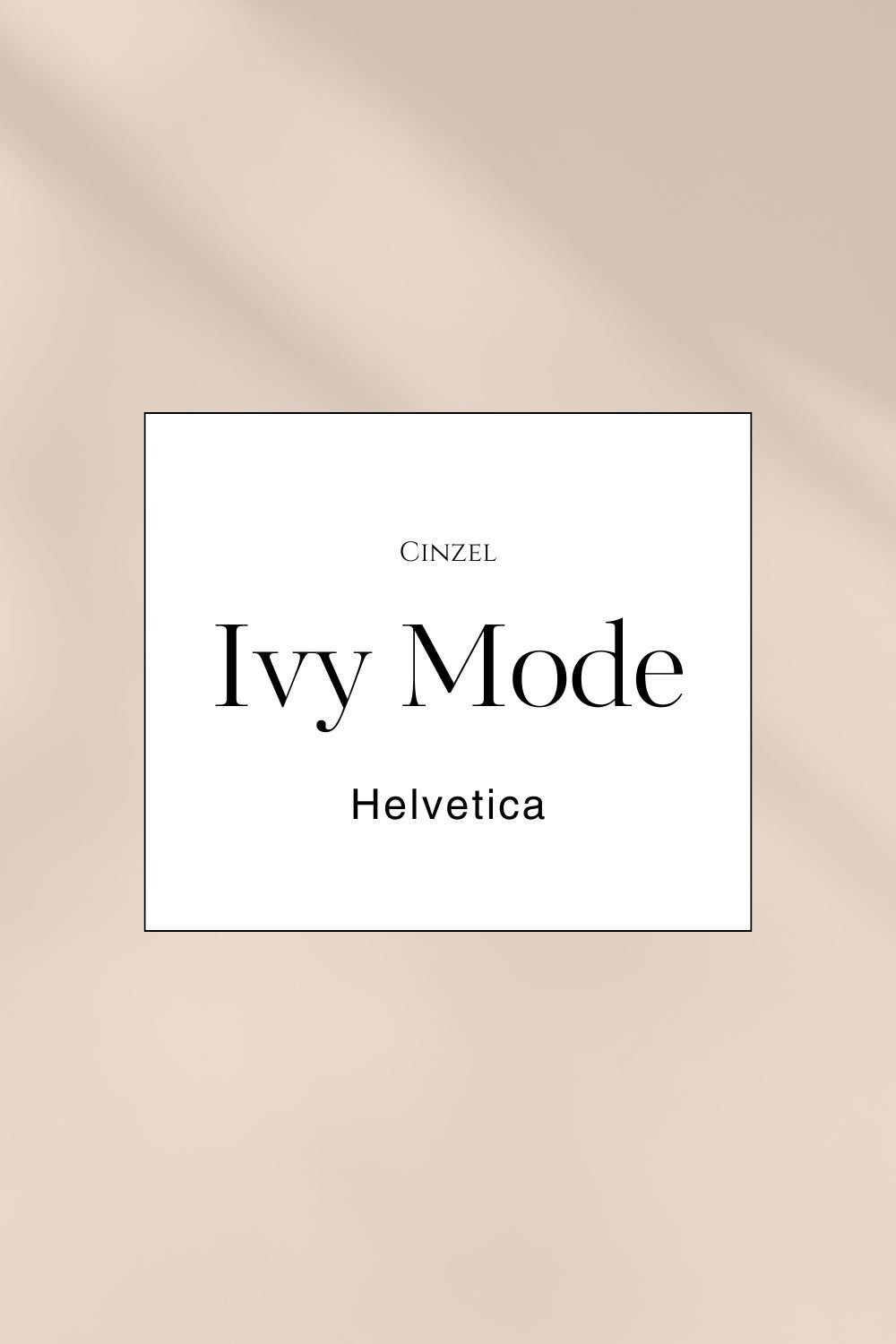
11. Refined and Elegant
Header: Ivy Mode
Paragraph: Helvetica
Accent: Cinzel
Why it works: Ivy Mode's stylish and refined design makes your headers stand out with a touch of sophistication.
Helvetica, with its clean and classic appearance, ensures your paragraphs are easy to read and visually appealing.
Cinzel adds a hint of classical elegance as an accent font, perfect for emphasizing important information and bringing a refined touch to your design.
Best used for: Therapist and coaching websites that aim to convey refinement and elegance, appealing to clients who appreciate a sophisticated and high-quality presentation.
Color Palette Suggestion: Pair these fonts with a mix of rich, neutral colors like deep navy, cream, and gold accents to enhance the refined and elegant feel.
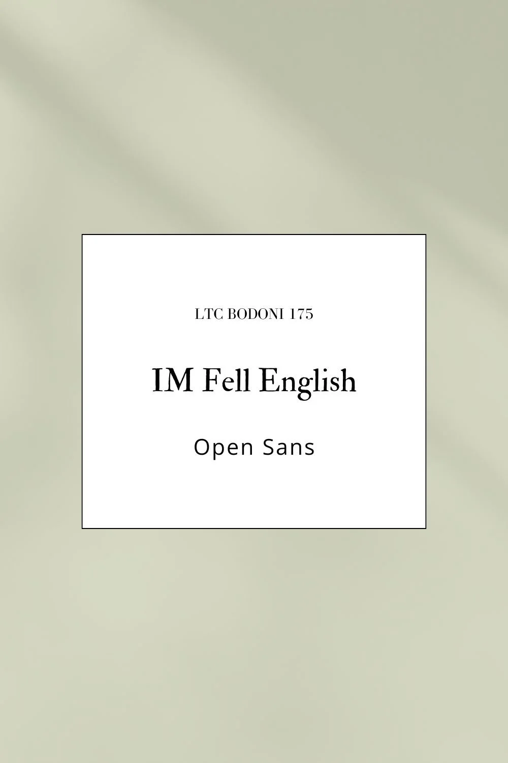
12. Vintage and Classy
Header: IM Fell English
Paragraph: Open Sans
Accent: LTC Bodoni 175
Why it works: IM Fell English brings a touch of vintage charm to your headers, evoking a sense of history and elegance.
Open Sans keeps your paragraphs clean and easy to read, providing a nice contrast to the vintage header.
LTC Bodoni 175 adds a classic and stylish flair as an accent font, perfect for emphasizing key information with a classy touch.
Best used for: Therapist and coaching websites that want to convey a sense of timeless elegance and classic sophistication.
Color Palette Suggestion: Pair these fonts with warm, earthy tones like sepia, cream, and deep brown, with accents of antique gold to enhance the vintage feel.
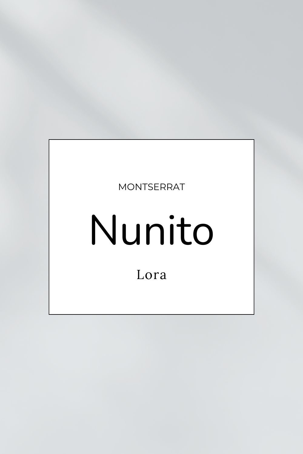
13. Fresh and Contemporary
Header: Nunito
Paragraph: Lora
Accent: Montserrat
Why it works: Nunito’s rounded, friendly style makes your headers look fresh and inviting.
Lora offers a touch of elegance and readability for your paragraphs, creating a nice balance between modern and classic.
Montserrat as an accent font adds a contemporary and stylish touch, perfect for highlighting important information.
Best used for: Therapist and coaching websites that aim to convey a fresh, modern, and approachable vibe.
Color Palette Suggestion: Use a combination of soft pastel colors like mint green, light gray, and peach, with bold accents like navy or coral to keep things fresh and contemporary.

14. Bold and Minimalist
Header: Bebas Neue
Paragraph: Roboto
Accent: Libre Baskerville
Why it works: Bebas Neue’s bold, condensed style makes a striking statement in headers.
Roboto offers a clean, modern look for your paragraphs, ensuring readability and simplicity.
Libre Baskerville adds a touch of classic elegance as an accent font, providing a refined contrast to the bold and minimalist design.
Best used for: Therapist and coaching websites that want to make a strong, impactful impression while maintaining a minimalist aesthetic.
Color Palette Suggestion: Go with a high contrast palette like black and white, with subtle accents of metallic colors like silver or bronze to enhance the minimalist feel.

15. Stylish and Modern
Header: Proxima Nova
Paragraph: Merriweather
Accent: Raleway
Why it works: Proxima Nova’s clean and modern style makes your headers look stylish and professional.
Merriweather offers a classic, readable serif for your paragraphs, creating a nice balance between modern and traditional.
Raleway as an accent font adds a sleek, contemporary touch, perfect for emphasizing important information.
Best used for: Therapist and coaching websites that want to project a stylish, modern, and professional image.
Color Palette Suggestion: Pair these fonts with a combination of cool neutrals like gray and white, with accents of bold colors like royal blue or emerald green to keep things stylish and modern.

Tips for Choosing the Perfect Font Combo for Your Therapist Website
Selecting the right font combination for your therapist website involves more than just picking what looks good. It’s about balancing aesthetics with readability, consistency with variety, and ensuring that your choices align with your brand’s personality.
Here’s a guide on how to decide when picking font combinations, including considerations for serif vs. sans-serif fonts, mixing styles, and choosing fonts for different purposes.
Serif vs. Sans-Serif: Understanding the Basics
Serif Fonts: Serif fonts have small lines or strokes attached to the ends of letters. They are often perceived as traditional, reliable, and professional. These fonts can be a great choice for headers if you want to convey trust and authority. Common serif fonts include Times New Roman, Georgia, and Merriweather.
Sans-Serif Fonts: Sans-serif fonts lack the small strokes found in serif fonts, giving them a clean and modern look. They are typically easier to read on screens and are associated with simplicity and straightforwardness. Popular sans-serif fonts include Arial, Helvetica, and Open Sans. These fonts are excellent for body text due to their readability.

Mixing Serif and Sans-Serif Fonts
Combining serif and sans-serif fonts can create a visually appealing contrast that enhances your website’s design. Here’s how to do it effectively:
Headers and Body Text:
Use a serif font for headers to establish a sense of professionalism and authority.
Pair it with a sans-serif font for body text to ensure readability and a modern feel.
Accent Fonts:
Choose an accent font that complements your primary fonts without overpowering them. Accent fonts can add a touch of personality and are best used sparingly, such as in call-to-action buttons or quotes.

Considerations for Choosing Header, Paragraph, and Accent Fonts
Headers: Headers should grab attention and clearly define sections of your content. They can be more decorative than body text but should still align with your overall brand image. Serif fonts often work well here, but sans-serif fonts can also be effective, especially if your brand is more modern.
Paragraph Text: The primary focus for paragraph text should be readability. Sans-serif fonts are typically preferred for longer text due to their clean and simple lines. Ensure the font size is comfortable to read on all devices.
Accent Fonts: Accent fonts add flair and draw attention to specific elements, like call-to-action buttons or highlights. Choose an accent font that complements but contrasts with your primary fonts. It should stand out without clashing or becoming overwhelming.
Tips for Choosing and Combining Fonts
Complementary Styles:
Pair fonts with complementary styles. If you choose a bold serif font for headers, balance it with a clean, straightforward sans-serif font for body text.
Hierarchy and Contrast:
Establish a clear hierarchy with your font choices. Headers should be distinct and easily distinguishable from body text. Use contrast in size, weight, and style to create visual interest.
Readability:
Prioritize readability in all your font choices. Avoid overly decorative fonts for body text or any essential information.
Consistency:
Maintain consistency throughout your website. Use the same font combinations for similar elements to create a cohesive and professional look.
Personality and Brand Alignment:
Choose fonts that reflect your brand’s personality. A modern therapy practice might opt for sleek, sans-serif fonts, while a more traditional practice might choose classic serif fonts.
Testing:
Test your font combinations on different devices and screen sizes. What looks good on a desktop might not be as effective on a mobile device.

Common Mistakes to Avoid
1. Ignoring Line Spacing and Letter Spacing:
Why It Matters: Proper spacing improves readability and overall aesthetic.
How to Do It: Adjust line-height and letter-spacing properties in your CSS to ensure text is well-spaced and easy to read.
2. Not Checking Licensing:
Why It Matters: Using fonts without the proper licenses can lead to legal issues.
How to Do It: Always check the licensing requirements for any font you use, especially if you’re using premium or custom fonts.
3. Overlooking Consistency:
Why It Matters: Inconsistent use of fonts can make your website look unprofessional and disjointed.
How to Do It: Maintain consistency in font usage across different sections of your website. Stick to the chosen font combinations for headers, paragraphs, and accents.
Consistency in Fonts Across All Platforms: Why It Matters and How to Achieve It
Maintaining consistent fonts across all platforms—including your website, social media, business cards, and marketing materials—is crucial for creating a cohesive and professional brand identity. Here’s why it matters and how you can achieve font consistency across all your platforms.

Why Font Consistency Matters
1. Brand Recognition:
Importance: Consistent use of fonts helps create a recognizable brand. When your audience sees the same fonts across different platforms, they start associating them with your brand.
Impact: Strong brand recognition builds trust and familiarity, making it easier for potential clients to remember and choose your services.
2. Professionalism:
Importance: Using the same fonts across all platforms conveys professionalism and attention to detail.
Impact: A cohesive look across your website, social media, and print materials makes your practice appear well-organized and reliable.
3. User Experience:
Importance: Consistent fonts create a seamless user experience, reducing confusion and making it easier for clients to engage with your content.
Impact: Whether clients are reading your blog, looking at a social media post, or holding your business card, they should have a consistent visual experience that reinforces your brand.
You got this!
Choosing the right font combination can significantly impact the look and feel of your website. These fifteen Squarespace font combinations offer a range of styles to suit different brand personalities and website purposes.
Experiment with these combinations to find the perfect match for your site and make a lasting impression on your visitors.

Hey! I’m Ellie, therapist slash web designer.
I help therapists like you build authentic, beautiful websites to fill their schedules with best fit clients- minus the overwhelm!